
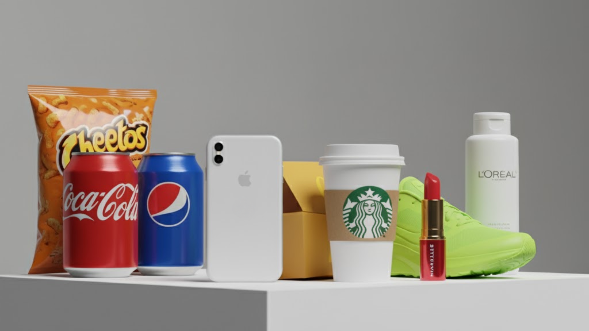
Whenever you hear the name of any brand, let's say burger king, the picture that comes to mind is a burger obviously but accompanied with yellow and red color. The very first thing that comes to your mind when you hear Tiffany is the pale robin's-egg blue. That is how the color scheme operates, our minds are programmed such that a brand gets linked to a color for a longer duration even if it does not form part of our daily life. It is not merely the memory, but a selection of colors by taking into account psychology and marketing science that makes it hit.
In branding, colors aren’t just decorative elements. They carry emotional weight, influence decision-making, and help carve a brand’s place in the consumer’s memory. This article dives into the science of color theory in branding, revealing how different hues affect consumer perception and how businesses can harness them to build stronger connections with their audience.
What is Color Theory in Branding?
Color theory is an art and science combination. Art is the exploration of how colors interact and what effects they create when used together. Where science is the tactical application of these principles to visually convey a brand's personality, values, and message.
While a color scheme appears to be something that is purely aesthetic and not considered properly. But, it works the opposite way around, it has to be something that is determined by marketing information, cultural symbolism along with extensive research of psychology.
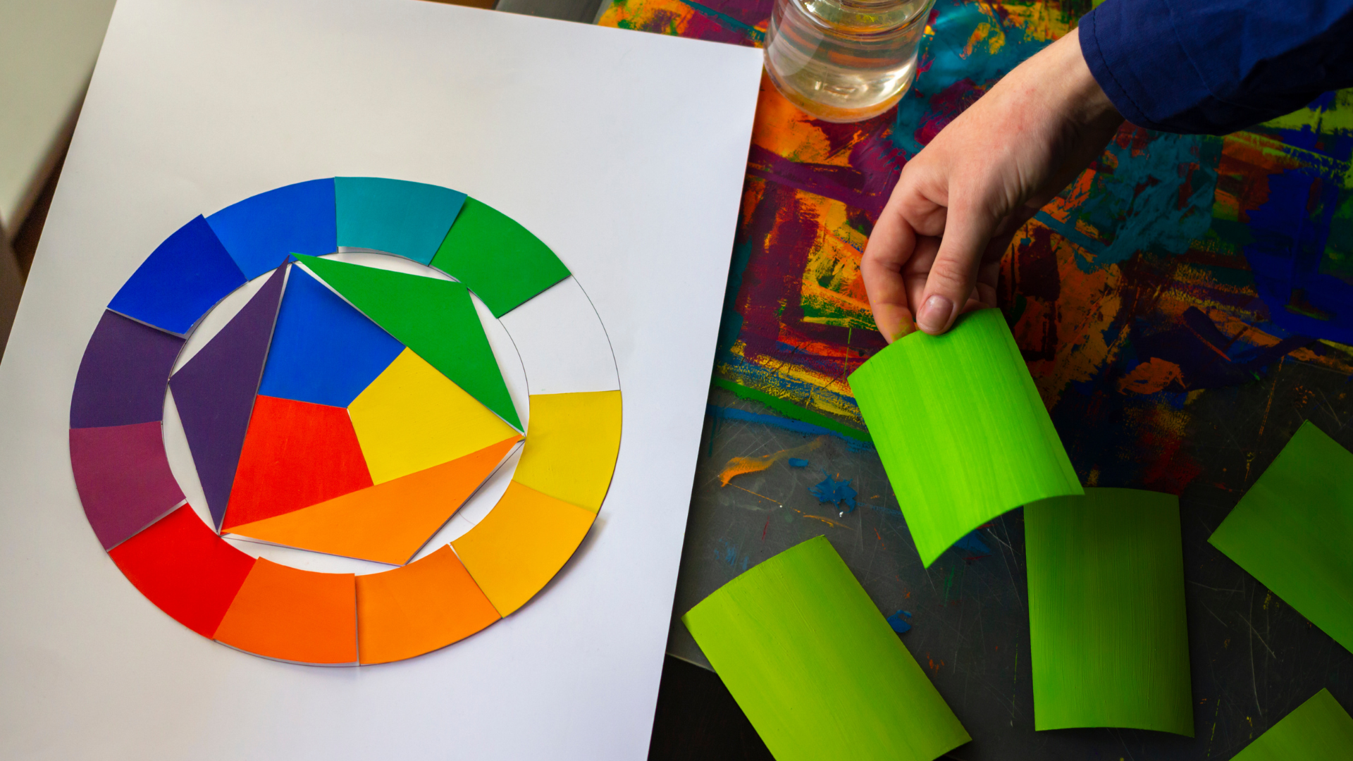
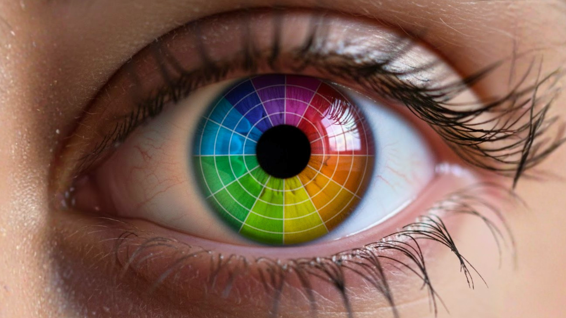
Wait, how is psychology research a component of color theory? Well, we all know the fundamentals of color wheel, a visual aid for primary, secondary, and tertiary colors. From there, designers play with relationships like complementary colors (opposites on the wheel for contrast), analogous colors (neighbors on the wheel for harmony), and monochromatic schemes (shades of one color for cohesion).
Here the catch is not picking the right combination according to one's preference. It's all about the emotional and psychological effect that the colors will create for your target audience.
The Psychology Behind Color Choices
Colors contribute significantly to what you feel and do in front of the entity, colors that work for a retail business will not work for a hospitality brand. They construct required consumer behaviour by influencing your moods, dictate your selections, and have diverse meanings based on where you are or what culture you practice. It is understanding these that enables you to utilize colors appropriately in branding.
1. Emotional Association with Colors
Colors evoke certain emotions in your psyche. For instance, red tends to evoke a rush of excitement or urgency, which is why it is applied in clearance or sales signs. While blue makes you feel relaxed and trustworthy, usually preferred by banks or medical brands.
Yellow is able to capture your attention and evoke a sense of happiness (you know why, color of sunshine for reason). Green is most often linked to growth and health, which is why it's used for green products that are environmentally friendly.
These emotional responses aren't arbitrary; they are linked to the way our brain handles colors and their relation to common objects or experiences. This knowledge is key in order to choose colors that align with the message your brand wants to send. The right color can encourage customers to trust your brand or feel positive about it, which creates a favorable environment for purchases.
2. Color Perception and Consumer Behavior
The purchasing choices are usually influenced by the way the consumer thinks about color. Warm or bright colors such as orange or red will instill a sense of urgency, making you act fast. Cool colors such as green or blue will make you feel safe, which will lead to more time spent interacting with a brand.
Colors also affect customer judgment regarding a product's quality. For instance, most high-end brands focus on black or dark colors, which exudes sophistication and rarity. Meanwhile, plain or light colors may convey friendliness and openness.
Your color response impacts your probability of purchase, your recall of the brand, and your overall product experience. These responses are used by marketers to enhance brand awareness and conversion rates.
3. Cultural Influences on Color Meaning
The significance of color also varies with borders or communities. White means purity and peace in some cultures, but in others, it is linked with mourning. Red is considered to be bright, fortunate and positive in most Asian cultures but can be a sign of danger or warning in Western nations.
When a brand wants to sell worldwide, these variations in the same color meaning need to be understood. Selecting colors without regard to cultural influence can confuse or alienate consumers. That is why some companies modify various colors according to the target markets. Pepsi, one of the best-known food and beverage companies, changed their can color from blue to light blue specifically for the Argentina market. This is done to align with the identity of the country by aligning with their flag.
In addition to this, knowledge of color influence by culture enables you to prevent errors and resonate with the target market on a deeper scale. It indicates respect for their values and customs, which enhances your brand's credibility.
Why Color Consistency Matters for Brand Identity
As stated at the start, color is one of the strongest recognition-building weapons. What the research indicates is that consistency with brand color can make you recognize the brand by as much as 80%. Consider McDonald's golden arches, Starbucks' rich green, or Cadbury's regal purple. These colors are not merely about the appearance or visual, they are identifiers, they make a brand stand out the moment you lay eyes on the color.
That is why color consistency is a building block in brand identity. It makes sure that all customer touchpoints beginning with the product packaging through website banners ought to feel unbroken. Not only does it reinforce the memory of the brand but also, it helps to build trust among the target audience.
A consumer constantly subjected to the same color comes to link them with certain attributes, feelings, and experiences, meaning a mental shortcut to brand recognition. With time, this even determines buying behavior, as the brain yearns for familiarity and familiarity creates the sense of comfort. This comfort must be created to build a relationship between the target market and the brand.
Selecting the Appropriate Brand Colors
Then, how do you choose colors for a brand? It should be an intentional, research-based process. You first define the brand personality by making it clear what it is like. You should know clearly what your brand has to offer and what you desire the target market to connect your brand with? It can be adventurous and bold, trustworthy and relaxing, creative and playful, or luxurious and elegant.
After this is established, the second is to have an understanding of the target audience's preference and culture. Colors appeal in varying ways to varied audiences, and what is successful in one country may not work in another.
Competitors analysis also comes in handy when selecting the color palette, you don't want to replicate them but spot gaps. For example, if all brands within your sector have shades of blue, adding a unique warm tone can make you stand out. Still, choosing a main brand color is not sufficient, secondary and accent colors need to be selected to match and offer flexibility on marketing materials.
Lastly, testing is imperative (yes for color selection too), for which the color needs to be tested on screens, print, and various lighting to verify they hold their desired effect.
The Role of Color Harmony
A brand's palette typically comprises several colors that complement each other, but harmony among these colors must be achieved for visual attractiveness. How is this achieved? Depending upon your brand nature you can choose:
 Monochromatic Schemes – Multiple variations of a single color for a minimalist, clean appearance.
- Analogous Schemes – Next-to-adjacent colors on the wheel, evoking comfort and togetherness.
- Complementary Schemes – Directly opposite colors on the wheel, providing intense contrast and energy.
- Triadic Schemes – Three colors equally spaced on the wheel, balancing diversity with harmony.
- Tetradic Schemes – Four colors that make a rectangle on the wheel, flexible but demanding thoughtful balance.
When well executed, these pairings make brand imagery appear deliberate and refined in every area of advertising whether paid advertising, packaging, or social media.
How Color Affects Marketing and Conversions
In the past, HubSpot, a renowned AI customer platform, experimented with making a green call-to-action button red and noticed a 21% boost in conversions. This goes some way to demonstrate how slight changes in color can have quantifiable impacts on consumer actions. The function of color goes beyond that of visual identity; it can have a direct effect on buying decisions.
In marketing, there are colors that are utilized to elicit an action from the consumer. That is why most of the call-to-action buttons on websites are bright red or orange to instill a sense of urgency and get users to click. Yellow because of its warm, welcoming feel used to attract people to special deals. While darker shades such as black and gold are used for high-end products and exclusivity.
FAQs
Q: What is color theory in branding?
A: Color theory in branding is the strategic use of colors to convey a brand’s personality, values, and message. It combines art and psychology to influence consumer perception and behavior.
Q: How do different colors affect consumer emotions?
A: Colors evoke specific emotions: red creates urgency, blue builds trust, yellow grabs attention, and green conveys growth or health. Choosing the right color can positively influence customer decisions.
Q: Why is color consistency important for a brand?
A: Consistent use of brand colors strengthens recognition, reinforces brand identity, and builds trust with consumers by creating a familiar and reliable visual experience.
Q: How do cultural differences impact color choices in branding?
A: Colors have different meanings across cultures. For example, white symbolizes purity in some cultures but mourning in others. Brands targeting global markets must consider these differences to avoid miscommunication and resonate with local audiences.
Conclusion
The art of color theory in branding is about so much more than selecting colors that "look pretty." With today's competitive market where impressions are made in seconds, leveraging the power of color may be the key to being seen or being ignored. By exploring the technicality of color theory, brands are able to develop a visual identity not only to get noticed but also to gain long-term loyalty.